Table of contents
Open Table of contents
Summary
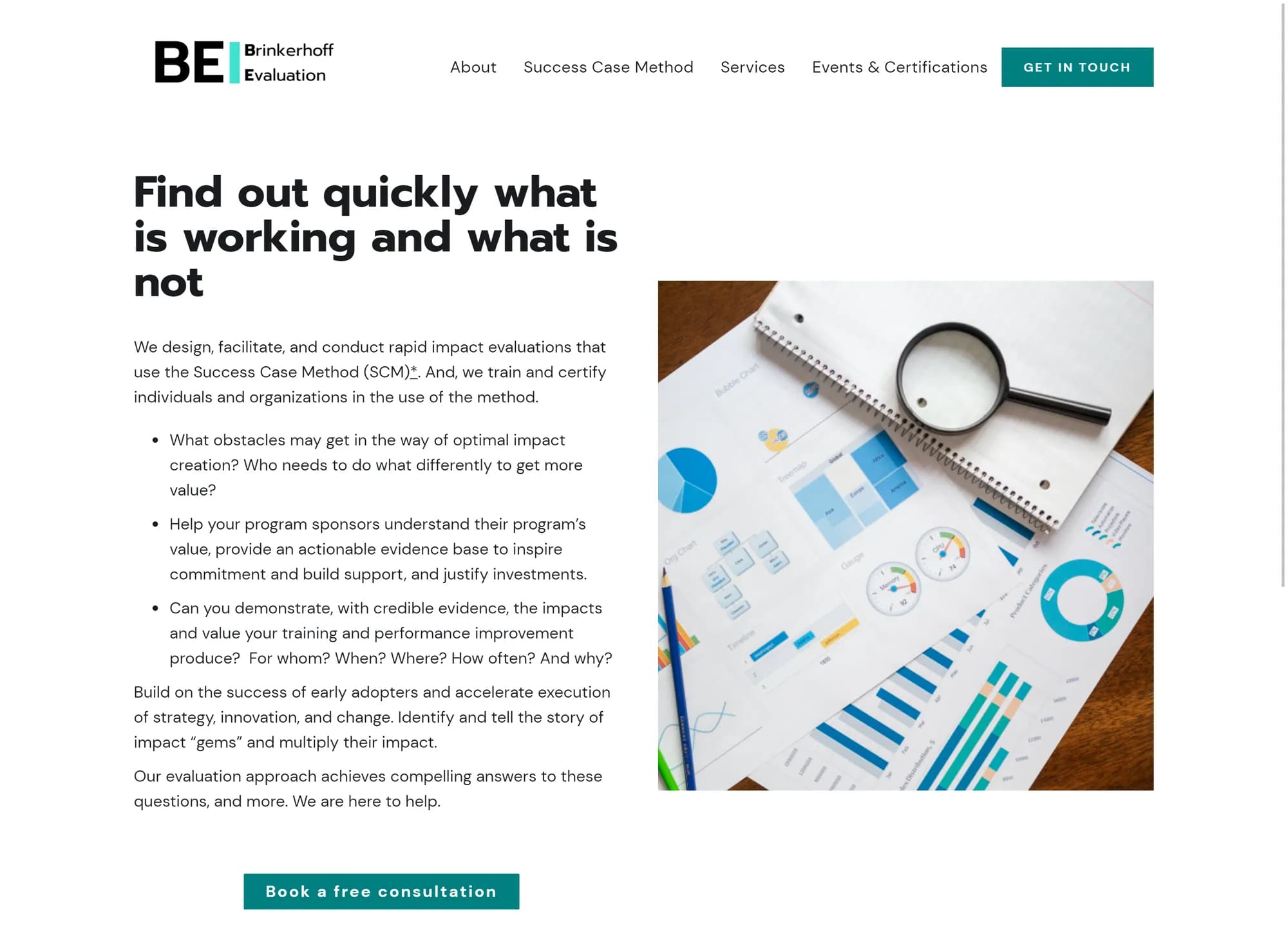
As a UX Generalist, I helped the Brinkerhoff Evaluation Institute (BEI) give their website a modern and professional update as a researcher, designer, and developer.
I worked in a team of four at DIA Design Guild alongside a User Researcher, a team lead who specialized in UX Design and Content, and a project manager. We had two months to finish so the client could start marketing the next cohort for their certification program.
Our team delivered a competitive analysis, user research findings, website design mockups, a brand kit, and a Webflow website.
Insights and activities
The DIA team conducted activities which helped BEI solve the problem of its outdated and lacking website by addressing its business needs.
1. BEI needed to refresh their brand
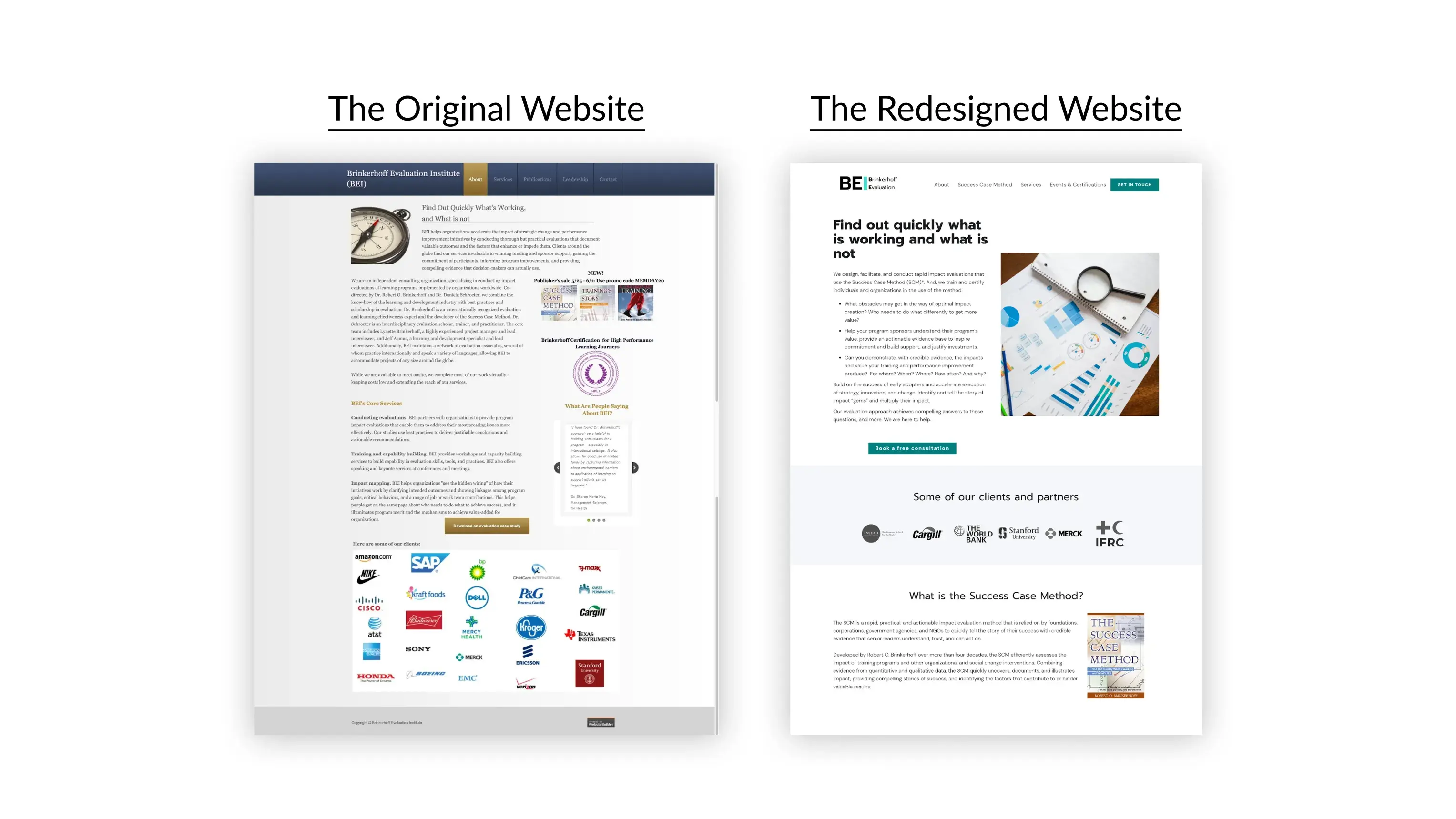
BEI had come under new management and wanted its brand to reflect that through their website while still honoring their founder’s legacy. Not to mention the website needed an up-to-date visual design, responsiveness, and a logo.

A comparison of the BEI website's original design and the new design we made for it.
To help BEI stand out, we had to learn what made them distinct from everyone else. I helped interview stakeholders along with our User Researcher to learn about the Institute’s background and work.

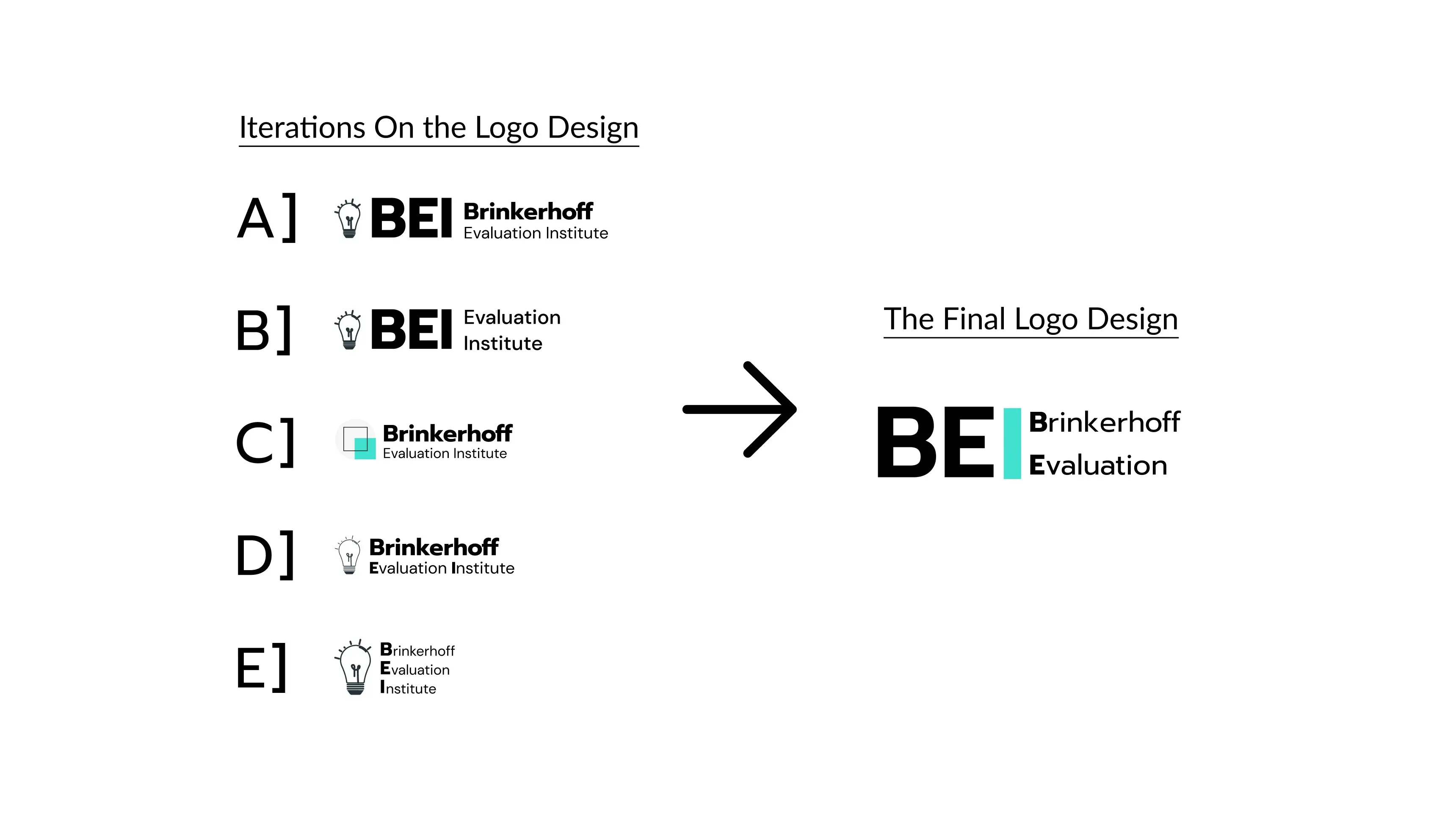
We presented multiple iterations of the logo to the client and incorporated her feedback into the final version.
While getting acquainted with them we also made a competitive analysis to get acquainted with their competitors.
Once we had the necessary information the DIA team ran a branding workshop to determine the new brand and its goals. This gave us a solid direction to take BEI’s logo and website design in, resulting in the creation of a brand kit.
2. The new BEI site had to center its unique selling point
BEI wanted to showcase its Success Case Method (SCM), which is both their consulting service’s unique selling point and the subject of its paid certification course. The new design for the BEI website had to focus on promoting the SCM course while still introducing the new BEI to users.
The progression of the Home page design from low-fidelity to high-fidelity. Since Webflow made it easy to start from desktop designs and adjust down to tablet and mobile views, we saved time by focusing only on desktop wireframes.
I worked with the team to design quick low-fidelity (lo-fi) wireframes that found the clearest way of organizing and presenting information on the website and got client feedback.
Once we had the website design’s structure down I helped turn our lo-fi wireframes into high-fidelity mockups where we visualized the final design and acquired more client feedback before implementing the actual site.
3. BEI needed an easy way to update their site content
The BEI team needed to focus on working with their clients and asked us to update the website content for them on an ongoing-basis, in addition to delivering the final functional website.
To do this we had to find a tool that made it easy to update the website content and sped up the development phase to meet our upcoming deadline.
I proposed Webflow because it let us replace the content inside the builder itself and made it easy to build and deploy a website without coding. This tool helped us meet our deadline and set up a workflow that made future updates fast and simple.
Outcomes and learnings
During the project we shared our progress with the client and presented the stakeholder interview and competitive analysis findings, wireframes and mockups, brand kit, and final website.
Outcomes
A year after the initial launch, from Dec. 5th, 2022, to Dec. 5th, 2023, users engaged with the site at an overall rate of 47%.
Some surprising findings are:
- Direct users made up 46% of users and were the least engaged at 35%.
- Organic search users made up 38% of users and were the most engaged at 59%.
- The smallest groups of users, referral users at 1%, and organic social users at 5%, were the most engaged at respective rates of 53% and 51%.
Based on these findings, I’d first find patterns in each mentioned user group’s behavior before determining if interviewing them would shed more light on the motivations and goals that drove them.
After the website launched, BEI thanked us for helping them craft their new brand and website. They also looked forward to partnering with us for any content updates and additional design work they needed.
Learnings
Throughout our process I noticed two things. First, our workflow was most inefficient when everyone worked on the same tasks with conflicting expectations. Second, the smoothest parts of the project were when we had a single person in charge of checking if our work was ready to share.
For example, I let our User Researcher take the lead on guiding me towards finishing the executive summary and it worked great. On the other hand, the entire team tried to work in Webflow and it became a nightmare of inconsistent components.
Based on these patterns, I believe that a faster and easier approach to collaboration for this kind of project is having individual team members own the parts of the project they specialize in. I look forward to seeing how well my lesson fares in other projects.
Oh, just one more thing…
Thank you for reading this case study!