Table of contents
Open Table of contents
Summary
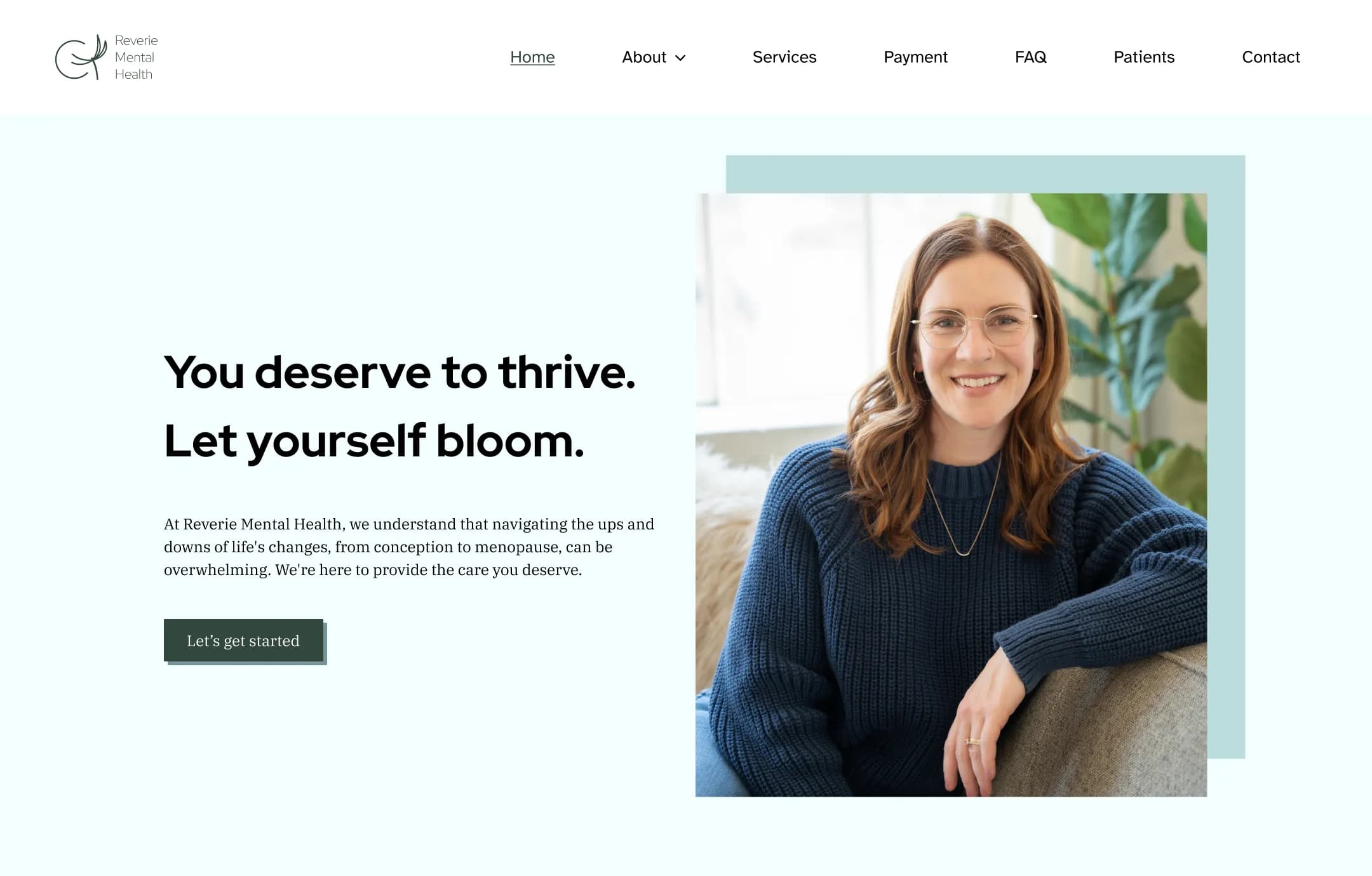
As a UX Designer I helped redesign Reverie Mental Health’s website experience to attract prospective patients. I worked in a team of three at DIA Design Guild with another UX Designer and a project manager for three months. Our team delivered a competitive analysis, website design mockups, and a design system to the client.
Insights and activities
The DIA team partnered with Reverie to work on activities that addressed their needs and problems.
1. Reverie needed to catch up to their competitors
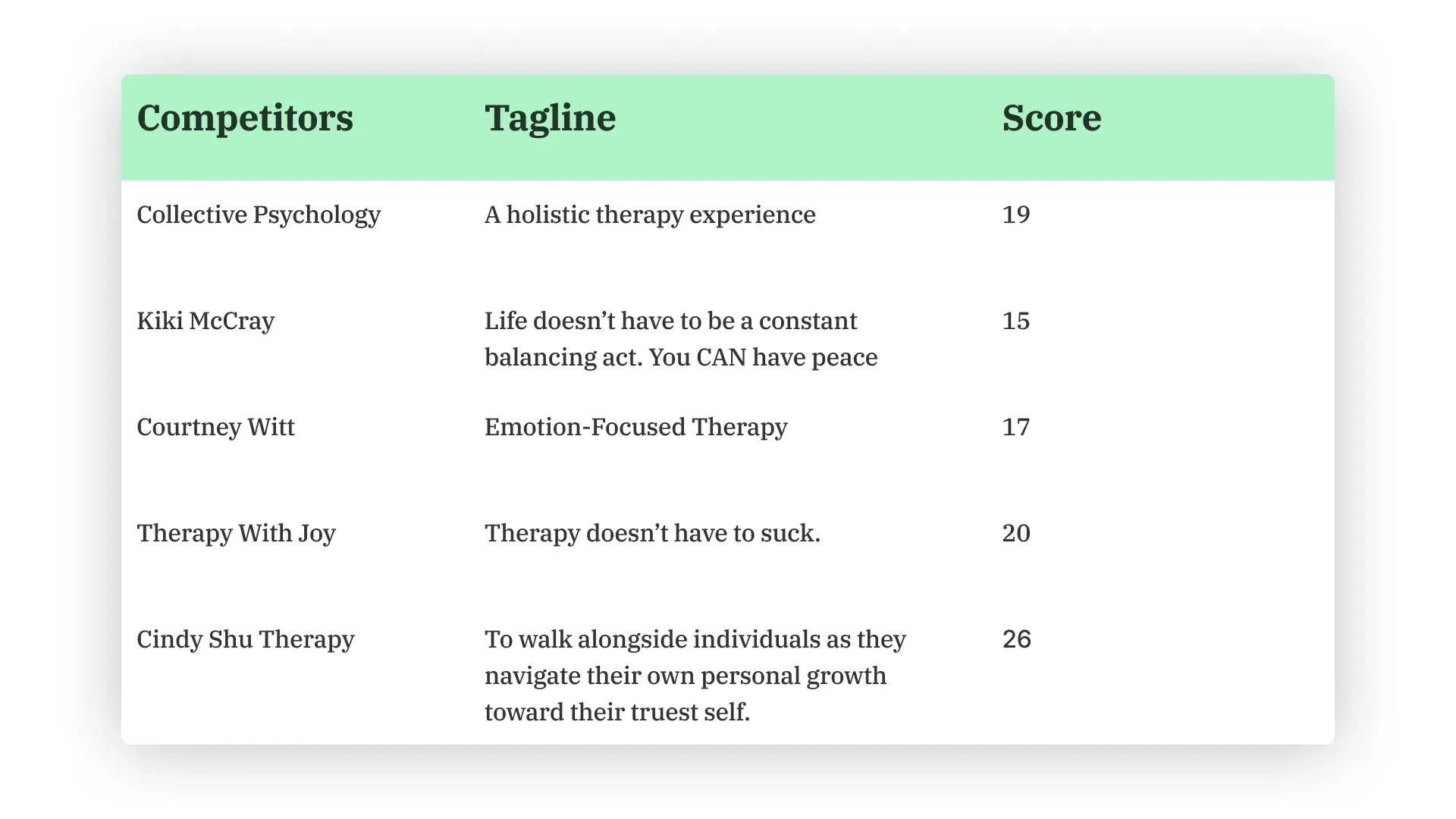
My team and I conducted a competitive analysis to assess what Reverie’s current website lacked compared to their competitors’ sites. We scored each competitor on areas such as usability, ease of navigation, service offerings, and more.

A summary of the competitive analysis we made for Reverie's competitors. Each one had various strengths and weaknesses which impacted their individual scores.
Our findings not only helped the client understand how other mental health clinics communicated with potential patients but also informed what we’d improve for the final design.
2. Reverie’s existing website was disorganized

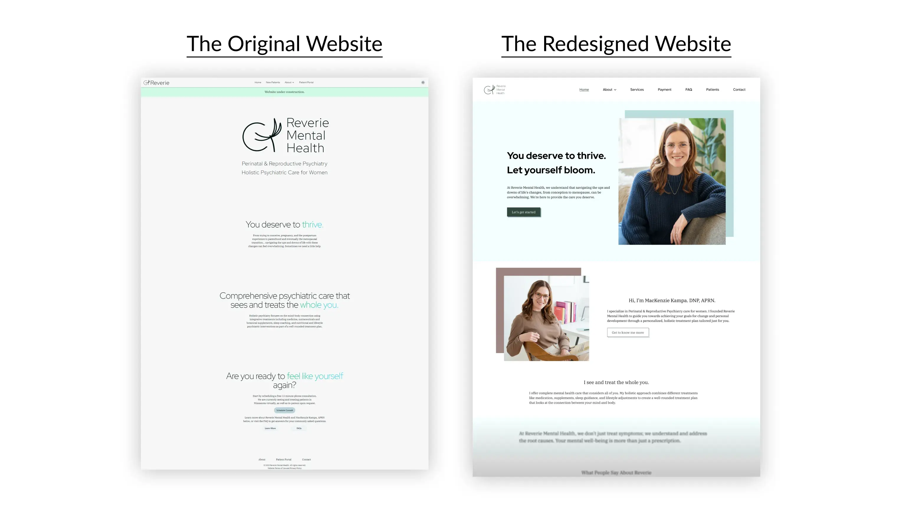
A comparison of Reverie's original website and the new version we designed.
The website’s disorganized structure made it hard to learn about the clinic and what it has to offer. In order to make this information clearer, the other designer and I worked together on creating low-fidelity wireframes.
Making these blueprints of the final design let us focus on creating a hierarchy that made navigating the site easier.
3. Reverie’s website lacked visual appeal
Desktop, tablet, and mobile high-fidelity mockups of various pages next to their low-fidelity wireframes. To meet the client's timeline we made responsive mockups after getting feedback and approval on the wireframes.
Some of the client’s biggest concerns was their website’s lack of visual appeal and inconsistent design. While translating the low-fidelity wireframes into high-fidelity mockups which showcased the site’s final appearance, my co-designer and I made a design system that gives guidelines on user interface (UI) details such as font styling, color accessibility, and button states.
Crafting mockups based on an organized structure gave us room to work on upgrading the site’s visual design. Establishing a design system ensured UI elements were used in a consistent way and helped the final design rather than hindering it.
Outcomes and learnings
Throughout the project we handed off the competitive analysis findings, high-fidelity mockups, and design system to the client and by extension, their developer.
Outcomes
Once the website launched, Reverie told us that they got compliments from clients and friends on the website’s new update. The client also sent us a nice message saying, “Just had a few people this week compliment the website, which is a testament to the work! Thank you again. We appreciate you!”
The team decided that this project was a success based on how we helped the clinic make a website that they were proud of and that felt more welcoming and approachable than its previous design.
Learnings
An important lesson I learned while helping Reverie is that design systems are useful even for smaller-scale projects. Without making a design system for our client, the mockups would have taken longer to review for errors. In addition, the developer would struggle to make simple changes if he didn’t have a set of guidelines to reference. Design systems should be made for any project using lots of UI elements as long as they’re scaled to the right scope.
Oh, just one more thing…
Thank you for reading this case study!