Table of contents
Open Table of contents
Summary
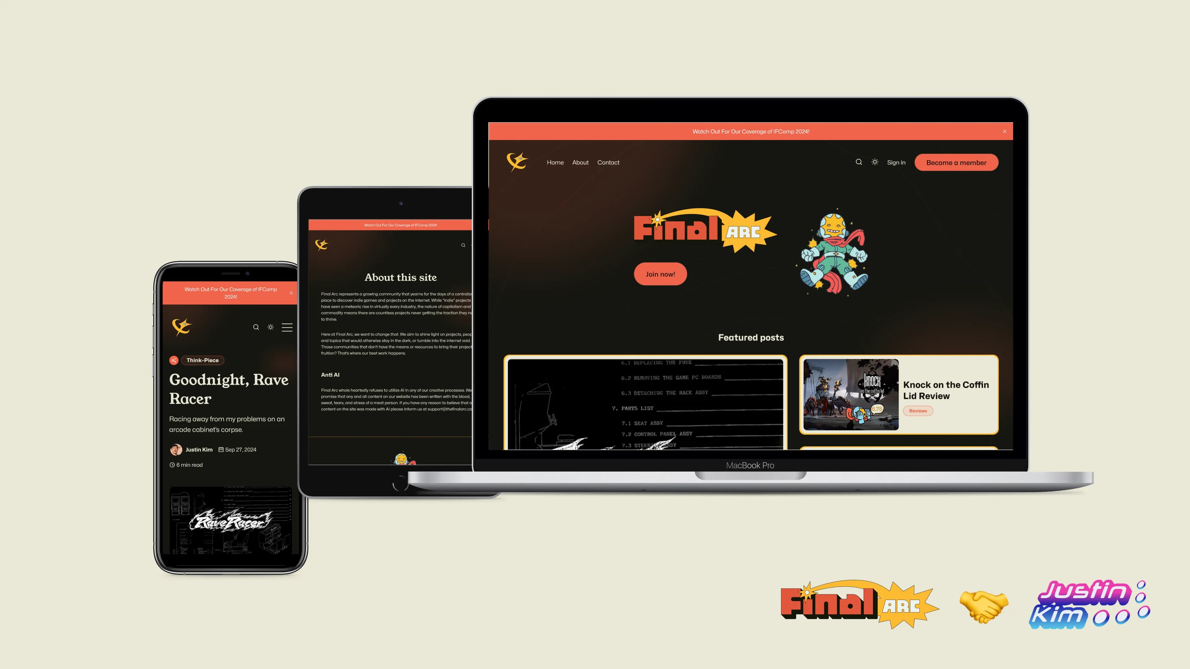
- Coded and helped design the website for Final Arc, an online publication focused on indie games and more.
- Implemented by customizing a Ghost CMS theme using HTML5, CSS3, and UI Design experience.
- Made the mascots dance when you hover over them.
- Results over three months: 390 new and active users, 1,555 site views, and 2.01% CTR.
The Mission (Which I Chose to Accept)
Final Arc is an online publication dedicated to sharing the latest and greatest independent projects on the internet with the rest of the world. In other words, they’re covering all the cool stuff creative folks are making.
Okay, so why is Final Arc important?
A video explaining how indie games rose to prominence. Video by Dosuka via YouTube.
Why is this important, you may ask? Indie media is finally getting the attention it deserves. We’re no longer in a world where a multi-million dollar media conglomerate is the only gateway to global success.
Thanks to factors such as free and open-source software and a consumer need for radically different experiences, anyone can find fame overnight by building and sharing their nifty creations with the world. But people need to find said creations in the first place.
Nice mission. But how’s Final Arc involved?
A video by an indie developer explaining how hard it is for indie games to succeed with marketing. Video by Johnny Ostad via YouTube.
The down-side to this new and exciting era is that large organizations with way more money and resources can push polished marketing campaigns which overshadow the efforts of mere hobbyists. That’s where Final Arc steps in.
By providing a single place to find the coolest stuff on the web, more people with an unsatiated taste for the new and weird can lay eyes on the projects that creators pour their blood, sweat, and tears into.
So where does ol’ Justin come in?

Hello, there. Tis I, Justin. I’m a UX Generalist who coded the website. I also write now for Final Arc, but that’s a different story.
Problems we had to figure out
Intro explaining what Webflow is. Video by Webflow via YouTube.
We had a couple of glaring challenges to solve. First and foremost, we had no website. Our original approach was to build the entire site using Webflow, a no-code website builder, but we ran into two hiccups.
Hiccup #1: No feasible (and affordable) tech stack
Our original strategy called for a strong social component where people could engage each with each other meaningful ways. Proposed solutions included an advanced commenting feature and customizable user profiles. However the Webflow integrations we found were pricy and inadequate to fully realize what we wanted.
Hiccup #2: We picked the wrong approach
To top it all off, we also realized that Webflow is just terrible for posting blog posts. Their editor is terrible1 for writing with and it would have taken wrangling together a whole other system just to make posting content easier. It would have defeated the whole purpose of launching a publication in the first place.
The solution we came up with
So if going with Webflow wasn’t the right way, then what was the right one? Well that’s why I said we picked the wrong approach, not the wrong tool. The main draw of Webflow was that our lead designer2 could build the website herself without us relying on a developer we couldn’t afford. As fate would have it, Webflow would still be in the game… But with a catch.
The catch in question
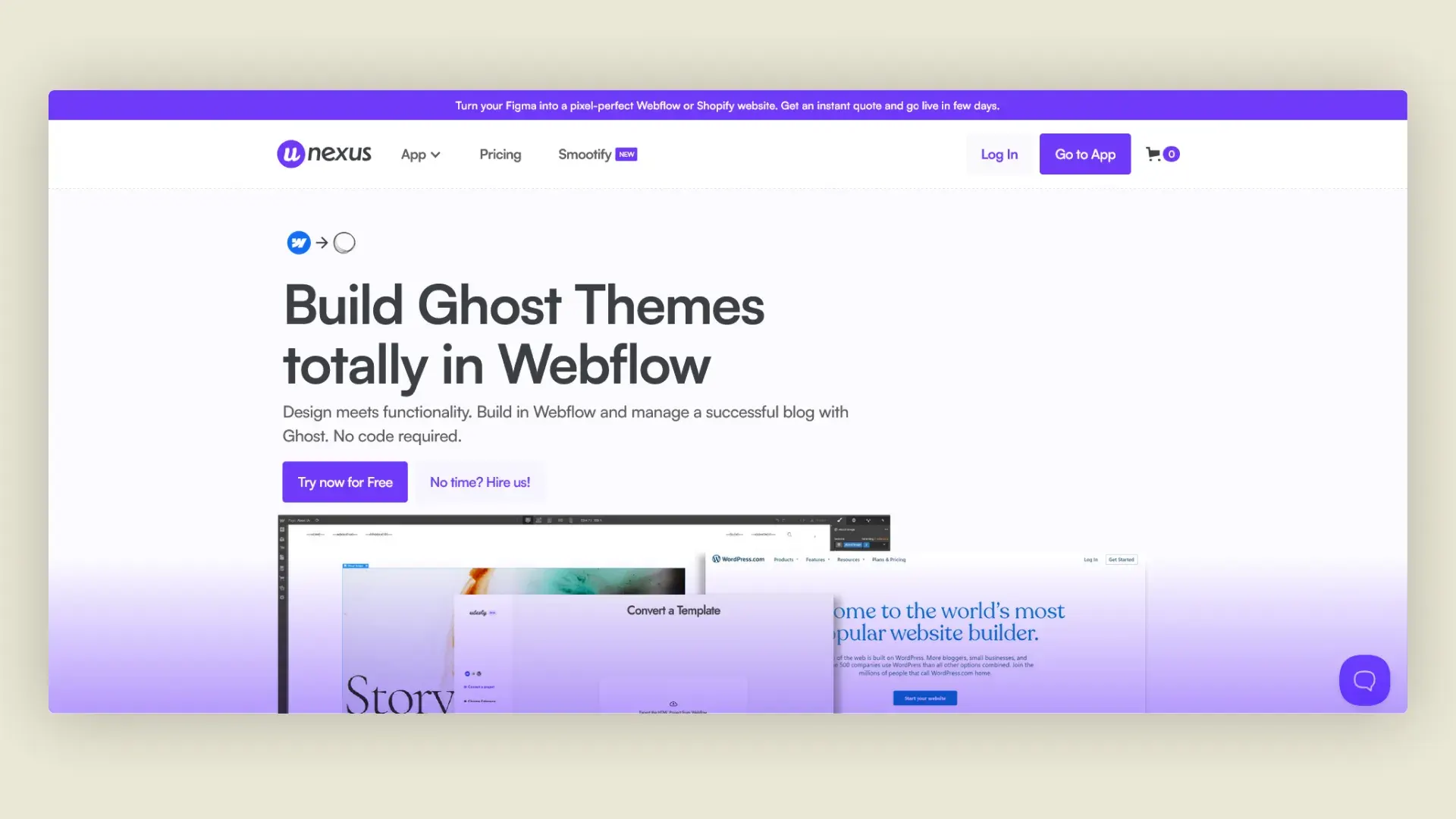
Image by Udesly via udesly.nexus.
The lead designer and publication owner3 gathered us in a meeting one day. They announced that due to the issues with Webflow I mentioned earlier in this case study, we’d switch to Ghost CMS but build the site using a Webflow integration.
What is Ghost CMS?
Video demonstrating Ghost CMS's dashboard. Video by Ghost via ghost.org.
Ghost CMS is a one-stop shop for building a blog website. Its simple and smooth word editor made publishing content way easier than anything Webflow could offer. Getting a basic, aesthetic, and functioning website up and running was also a cinch since Ghost uses templates. Not to mention, commenting and user profiles were already setup for us.
A new plan of attack and a new hiccup
To launch sooner and give our design team time to finish wireframing the responsive design as well as the final visual identity, an alpha launch website would be made using Ghost alone. We were going to buy a premium template because they look cooler than the free ones and were responsive right off the bat. All we had to do was apply some quick branding on it.
… Or so we thought. Here’s yet another hiccup we encountered: Even the premium template wasn’t up to par with our standards. Any visual change that couldn’t be made inside the Ghost dashboard required a web developer changing the template’s code itself. Yet another bummer---Or so everyone else thought.
One of my greatest moments yet
In one of the coolest experiences I ever had, I revealed my ability to customize the template. I had prior experience working with Ghost CMS and knew how to code. Not only that, I’m also a designer, meaning I could troubleshoot any ambiguities while implementing the designs. Even though the design team only finished wireframing the desktop view in anticipation of the original Webflow approach, it was no trouble to handle responsive issues myself. The Final Arc ship would be launching much faster than anticipated and in style, too!
Customizing the Ghost template
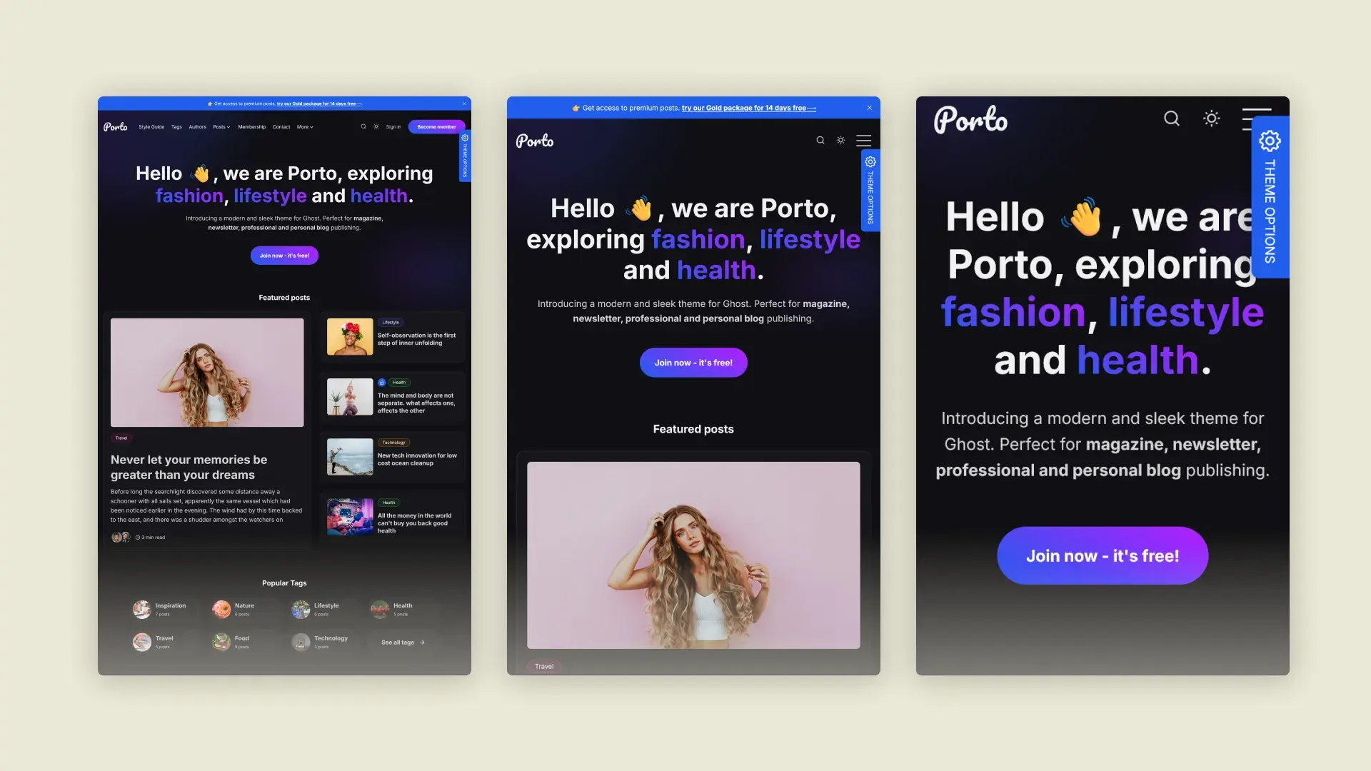
Various views of the Porto website.
Spoiler-alert: This was also one of my most terrifying moments. While I was treading familiar grounds, I quickly realized that getting this site up and running and looking the best it can (at that moment in time) was all on my shoulders. It’s a good thing, then, that I enjoy a challenge!
The template we used is GBJ Solution’s Porto theme, which had a slick and powerful aesthetic off the bat that suited Final Arc’s initial needs just fine. Specific styling changes to reflect the brand during its alpha launch were provided by the design team4.
The styling guide for the alpha launch website prepared by our design team.
While many issues were found and debugged, I’ll just share a few of the biggest hurdles I came across with you.
The journey of a thousand steps begins with the first problem
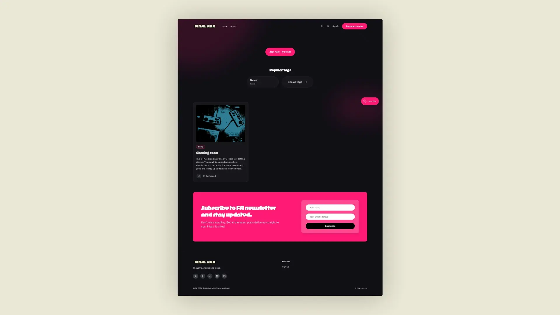
How the website first looked when I got the development environment running.
Getting my local Ghost developer environment up and running was the first issue I came across. Installing the most compatible version of Node.js and using the proper Gulp.js commands ensured any changes to the theme compiled and appeared in the browser.
Wrestling with fonts
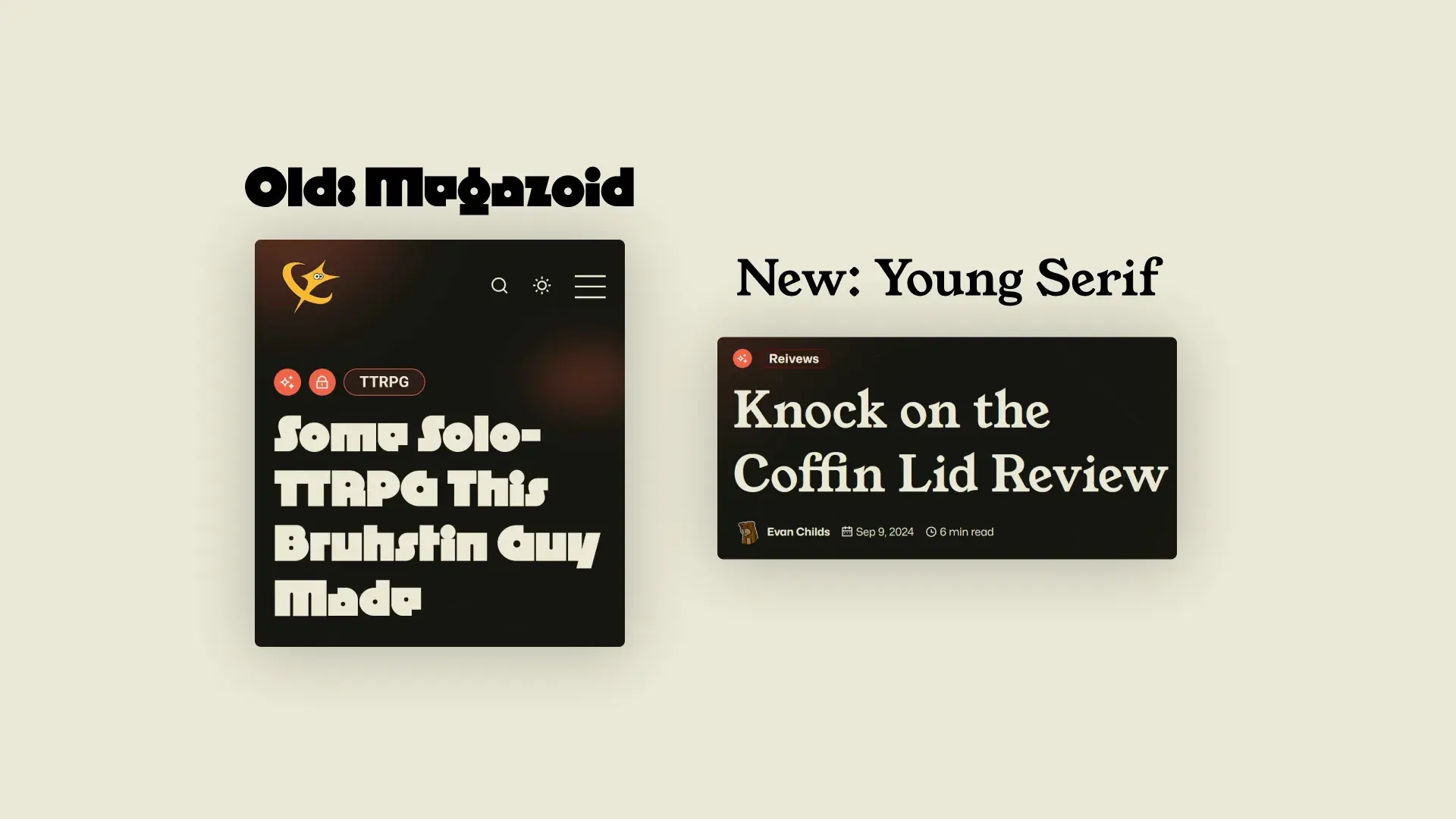
We originally went with Megazoid for titles and h1's but users complained it was too hard to read. So we went with Young Serif for legibility.
It’s embarrassing to admit but we’ve all been there---some of the fonts wouldn’t show up. After trying multiple approaches, I learned that they had to be imported via code injection. Was it a painful lesson? Yes. But am I going to forget anytime soon? No way!
Fixing surprise problems across device widths
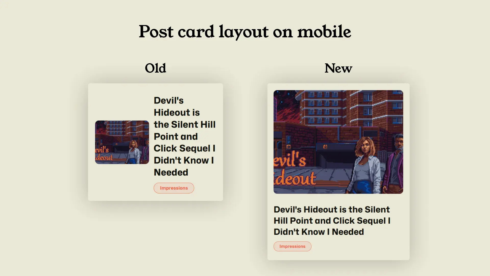
On mobile, the post cards became too squished, so we made them vertical to make reading titles and seeing the cover images easier.
Often an element a designer assumes resizes well across a range of breakpoints fails to do so in actuality. In one particular case, we had an issue with the post cards which preview the articles they point to.
They worked fine on a desktop view but became harder to read and unpleasant to look at the narrower the device width became. I used my design experience to determine a new breakpoint for the post cards. This way, they take on a new layout that’s optimized for users to read comfortably with at smaller device widths.
A fun little treat for myself
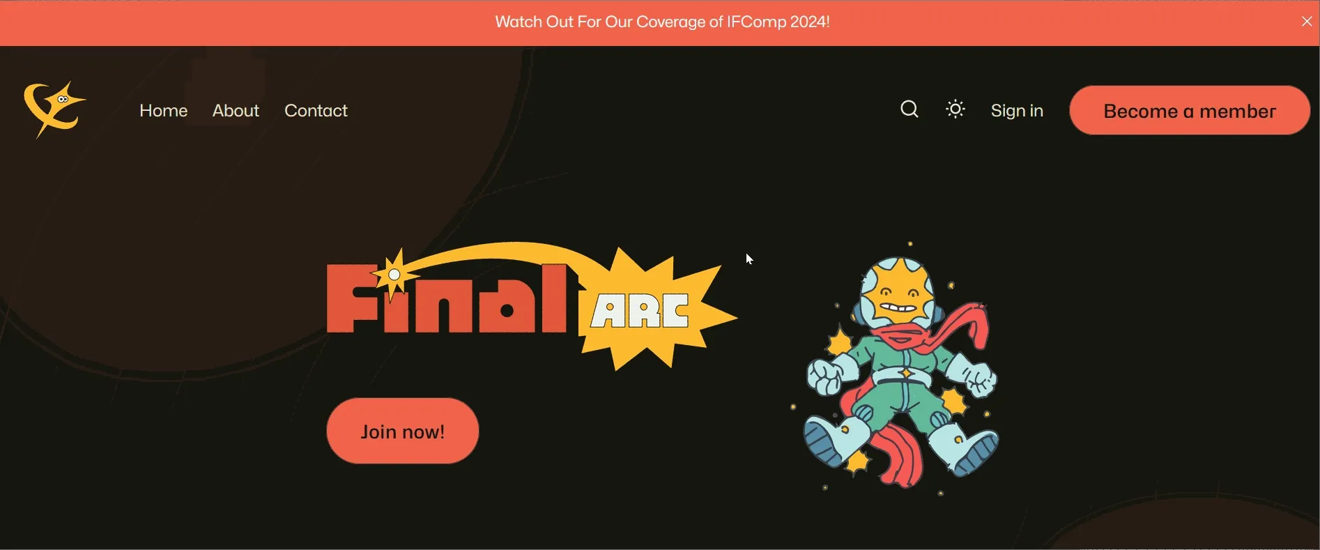
Indy and Jasper dancing adds a playful element to the site that sets a more casual tone. It wouldn't do for a publication focused on indie entertainment to come across as stiff and formal.
Developers need to have fun, too! To add a little charm to the website that aligned with the publication’s brand5, I made our mascot, Indy, and the publication icon, Jasper, dance when you hover over them.
Launching the site
At last, we launched the site. Over a period of 3 months, we tracked the visitors who came to the Final Arc site and observed what they were doing.
The full summary report for Final Arc's traffic and organic search performance is provided here for your convenience.
Traffic summary
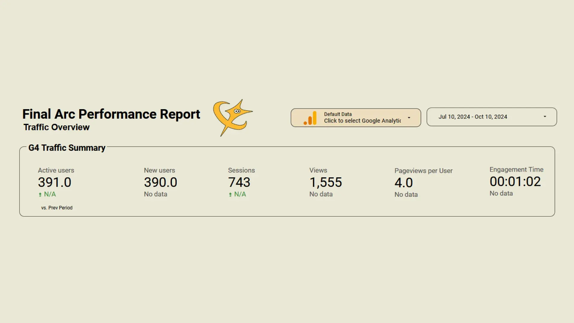
We had a surprisingly large number of people visiting the site itself since our launch.
To start with, we had 390 new and active users who spent more than 10 seconds on a page, looked at at least two or more pages, and interacted meaningfully with the site. That’s almost 400 separate people who checked us out!
Overall, the website was seen 1,555 total times, which is a great amount for a new site such as Final Arc’s. Users engaged with Final Arc on an average of about one minute and two seconds. This is an impressive feat considering an average engagement time found by Noble Intent Studios was 52 seconds.
Search engine ranking performance
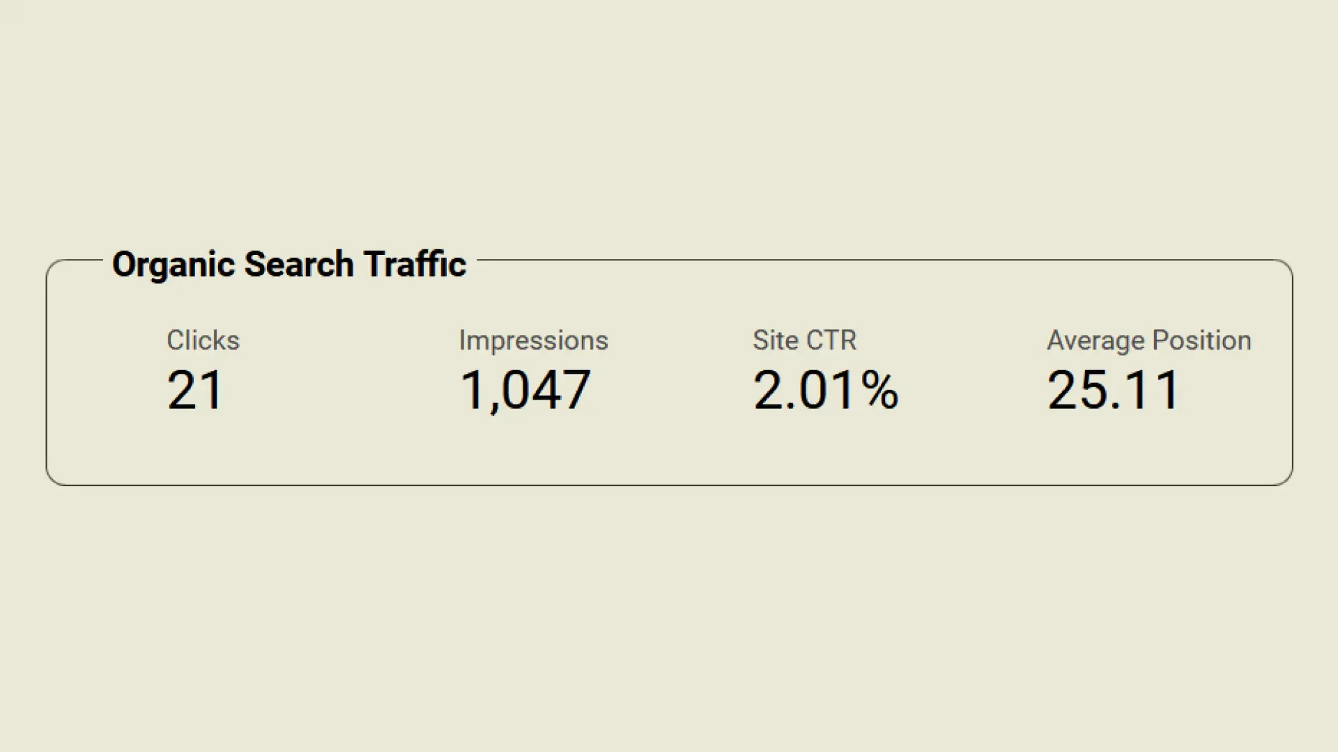
For a new website, we're well on our way towards building up a brand which people can find through search engines.
But how did Final Arc fare with organic search traffic? We received 21 clicks from organic searches which is to be expected. We haven’t grown a strong and widespread brand yet and most of our marketing tactics targeted online community gathering spaces.
On average, our click-through-rate (CTR) is at 2.01%, which is a great percentage for a brand new site when considering an average CTR of 3% or more is what’s generally desired for websites from an SEO perspective.
Cool numbers, but what does it all mean?
If we go strictly by the metrics measured across the three months since Final Arc opened shop, then they show that the website is doing pretty darn well for itself. Most new sites struggle to attract a lot of traffic when first starting out. With our initial performance, we’re on the right track to achieving our mission of shining a light on underserved indie projects.
For what it’s worth…
Numbers aren’t everything, after all. The biggest sign I knew we’re on the right path was receiving compliments from creators whose games we covered. Many of them complimented us on our mission, site design, and content quality. Coming from one of our primary stakeholder groups, this is the best indicator of success Final Arc could ask for.
Thanks for reading!
Like what you read? Interested in starting your own online publication? Need a Ghost expert who can get your website up and running in style? Talk with me on LinkedIn!
Notes
Footnotes
-
I used it back when it was still new. You don’t understand how mad I was that their overall UX still hadn’t improved. ↩
-
The man, the myth, Evan himself 🙏. Find him on LinkedIn, too. ↩
-
The design team at this point included not only Kat but also an amazing designer named Kristianne! Find her on LinkedIn as well. ↩
-
The brand wasn’t finalized yet, which gave us room to play and experiment! ↩