Table of contents
Open Table of contents
Summary
As a UX Designer I helped design and implemented the Partnership for Evaluation & Educational Research (PEER) lab’s first website. Their business goal was to showcase the lab’s work and to persuade potential clients to hire them.
I worked within a team of three at DIA Design Guild with a fellow UX Designer and a project manager for eight months. We delivered a competitive analysis, brand kit, site use documentation, and a website to the client.
Insights and activities
DIA partnered with PEER by conducting activities that gathered the needed information and materials to build the final site.
1. PEER needed a distinct identity
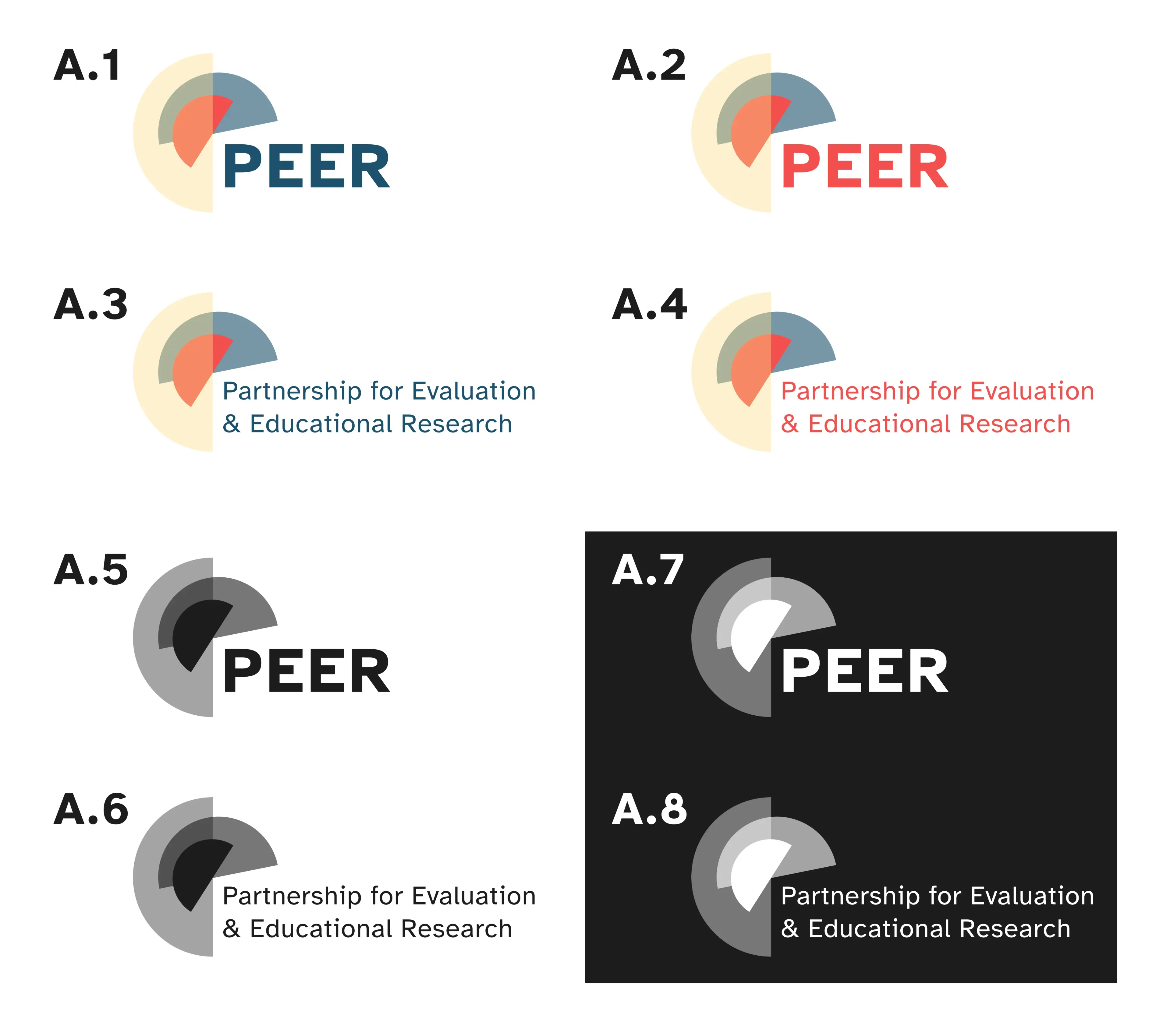
The PEER logo sheet showing different use cases.
Before the DIA team was brought in, PEER had no identity and all work was done under their lab head’s name. Later on, they’d come up with the PEER name during the branding workshop.
We first made a competitive analysis of eight other labs’ website to understand how they positioned themselves. Our findings not only helped us familiarize ourselves with the kind of branding prospective clients would expect from PEER but also gave us inspiration for how we could make the final website.
The client wanted the entire lab to contribute to the website, so we also ran stakeholder interviews with the lab members to learn their perspectives on what the lab’s website should be like. These findings informed the information we decided the website should share and helped the website’s design reflect their collective vision.
Our efforts culminated in a branding workshop where we had the lab members decide the brand’s personality and visual identity. I contributed one of the logo designs presented and the typography sheet for the brand toolkit, which also included the final logo and color palette.
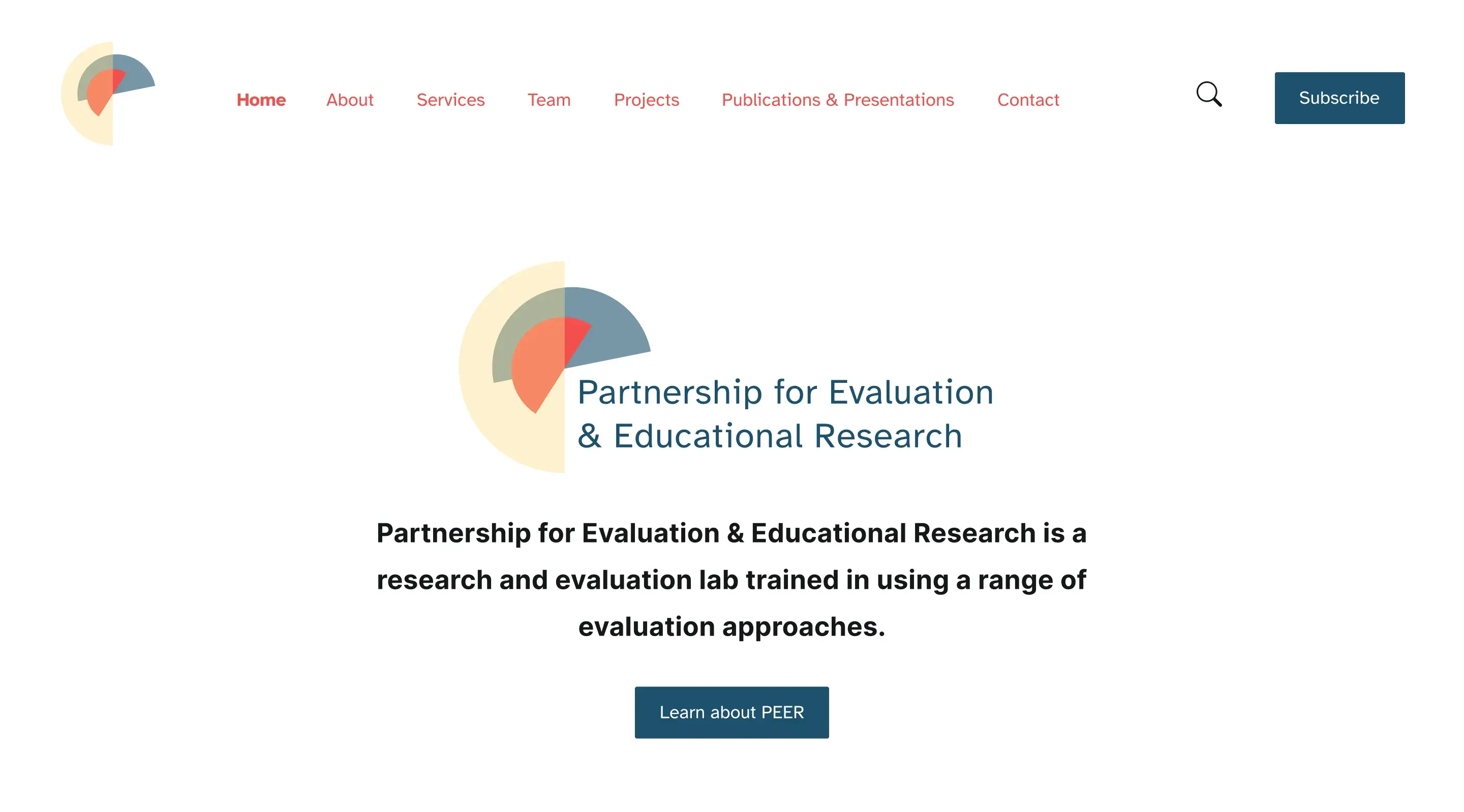
2. The website design needed to match the users’ and lab’s expectations
In addition to designing the site from scratch we also had to ensure that users wouldn’t be confused when they used it.
We started by mapping the site to plan where relevant information would go. We then visualized the website’s organization using low-fidelity (lo-fi) wireframes to determine how its information would be laid out and presented to users. These also gave us initial feedback from the client and stakeholders to make sure the site’s design included their input.
A sample of the lo-fi wireframes next to their hi-fi mockups. The Ghost template we chose came with built-in responsiveness so we focused on desktop designs only to save time.
After the lo-fi wireframes were done, tests were run with participants who matched the intended users as close as possible. Each subject first went through a tree jack test that determined if our assumptions of the design’s navigation scheme and arrangement of information matched the users’ expectations. Afterwards, we had them share their thoughts on the wireframes in impression tests to verify that the layouts made sense to them. Our tests were overall successful with feedback on minor areas for improvement, showing that the design matched what potential clients would expect when using the website.
Using the feedback from the treejack and impression tests, we iterated on the lo-fi wireframes by changing the layout design to reflect feedback from test participants. Then we turned them into high-fidelity mockups by applying visual styles from the branding toolkit such as the colors and fonts as well as the final web copy. These mockups elicited one more round of feedback from the client and stakeholders before we began implementing the final website.
3. The client and stakeholders had to learn how to manage the site
One of our client’s primary concerns was being able to make basic changes on the website such as updating content. We agreed to educate her and one of her lab members on using the tech stack to make the changes they needed after our involvement was over.
Our first step was to perform an assessment of the available technology for creating websites and managing content. We recommended three sets of tools and platforms that fit the client’s needs and budget constraints. This information helped the client take ownership of the project by informing her of how the lab could maintain the website content.
Our client decided to go with Ghost CMS, a blogging platform that comes with a site builder and various features for publishing and sharing content. We wrote documentation instructing the lab on important actions such as uploading new blog posts and sending out newsletter updates so they could grow their clientele. Afterwards I onboarded the lab member onto navigating the Ghost CMS interface and recorded our session for future reference. These deliverables ensured that the lab could work on their website without needing to rely on our team’s services.
Outcomes and learnings
By the end of the project we had handed off the competitive analysis, the branding toolkit, the final website on Ghost CMS, and documentation on managing the website in Ghost CMS.
Outcomes
1 year after the PEER website launched, from Nov. 1st, 2022 to Nov. 1st, 2023, users engaged with the site at an overall rate of 50.58%.
Some interesting findings include:
- Most new users were direct sources who could have come to the site through entering the URL into their web browsers or by clicking the PEER site link in an email.
- At an engagement rate of 75.27%, referral sources from other sites such as LinkedIn engaged with the website the most.
To improve the overall engagement rate, I’d propose:
- Looking into a newsletter strategy to share updates on the lab’s activities since the direct sources were most likely the client’s connections in their field who clicked on the link in an email sent out at launch.
- Considering a more personal community engagement strategy involving the more well-known members of the lab since referral sources interacted with PEER’s website the most despite numbering far fewer than direct sources.
Learnings
When I was less experienced I was always perplexed by test subjects who mentioned that the designs I made “didn’t make sense” to them. I was glad to learn through working on PEER’s website that the answer lies in using methods such as tree jack and impression tests to align the users’ mental models with early stage design forms such as lo-fi wireframes. By doing so researchers can find issues faster and needed changes can be made sooner.
Oh, just one more thing…
Thank you for reading this case study!