Table of contents
Open Table of contents
Summary
The team at DIA Design Guild brought me on for my UX Design background to help audit Episource’s risk adjustment platform and help the company’s stakeholders make sense of the then-current state of their product ecosystem. Our goal was to make recommendations for the future information architecture and design of Episource’s products based on our findings.
I worked within a team of five alongside another UX Designer, a User Researcher, a Data Scientist, and an Information Architect for six weeks. At the end of the project we delivered a report of our findings and recommendations along with other deliverables included inside.
Note: Certain materials can’t be shown due to an NDA.
Insights and activities
DIA dove deep into Episource, its products, and its stakeholders before suggesting how the products could be improved.
1. Making sense of Episource’s complex ecosystem
We started our project by understanding how the Episource products each worked. In order to gain this knowledge I helped our team interview nine different stakeholders who were either owners and managers of the company’s products or specialists with in-depth knowledge of the products’ functionalities. In between interviews we also reviewed any internal materials such as documentation, explanatory diagrams, and product demos.
We then used what we learned to make an ecosystem map of how all the different products either interacted or were supposed to interact with each other.
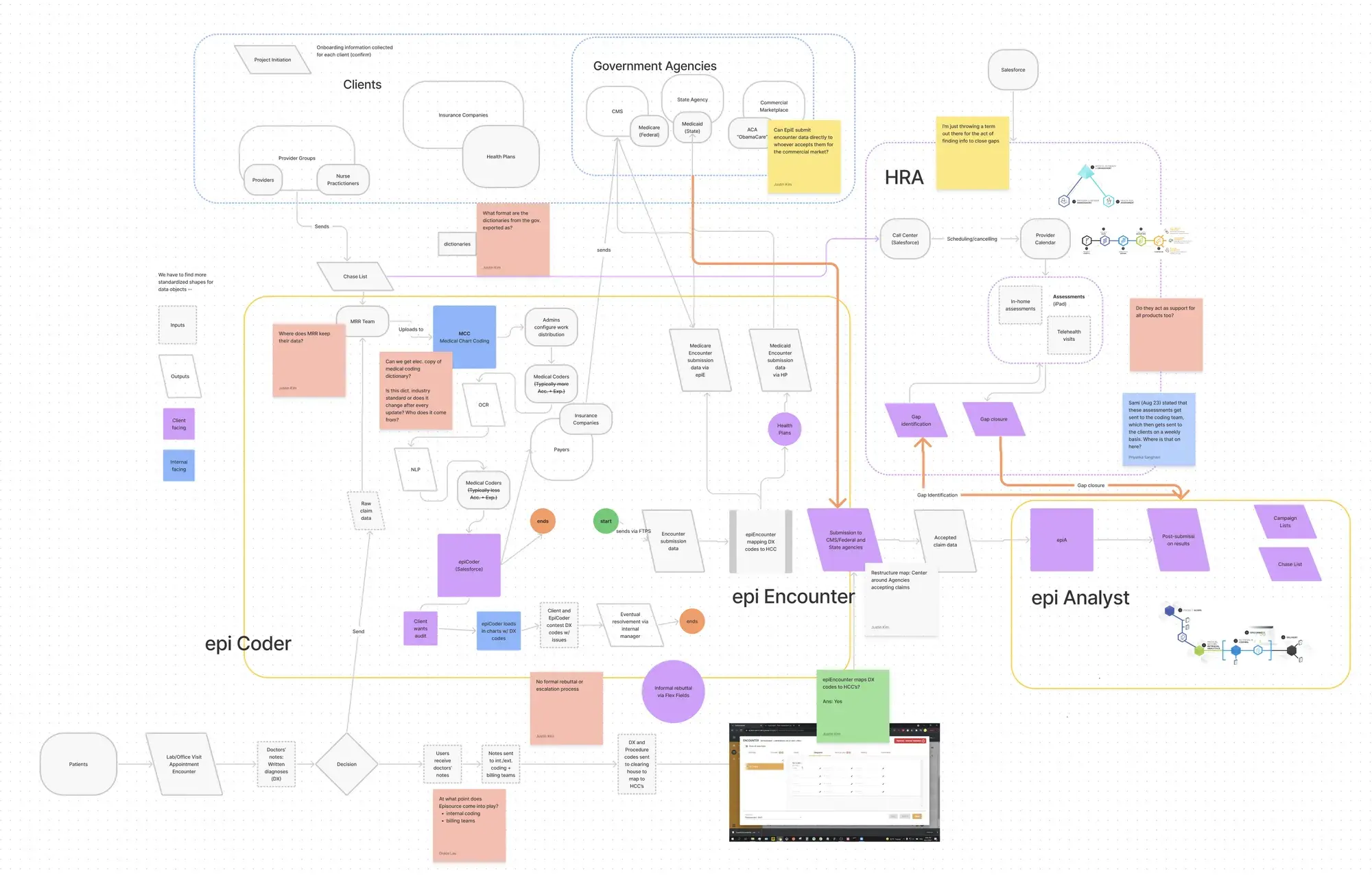
An overview of all the different products and services that make up Episource.
This map made stakeholders aware of not only how their products were related to the others but also made it easier to find opportunities for creating a more cohesive Episource experience.
2. Assessing Episource’s products
While interviewing stakeholders we made sure to understand each of the Episource products ourselves to find discrepancies between the intended conceptual models and the actual mental models users may form. To do this we audited the design of each product and assessed their usability by combining stakeholder interview findings along with results from individual heuristic evaluations and competitive analyses.
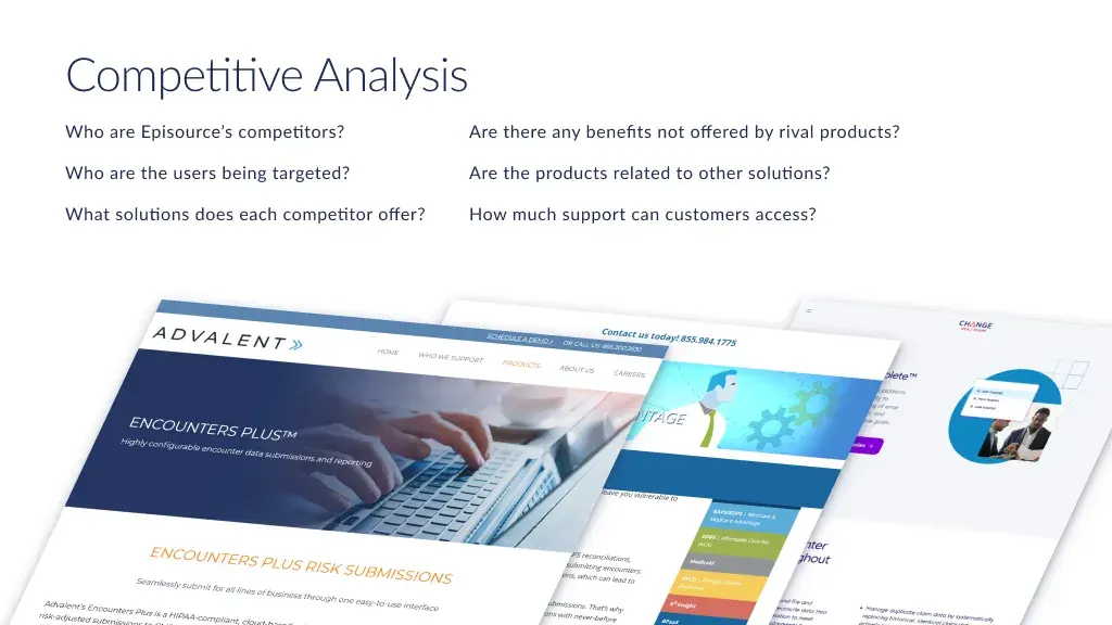
A list of some of the questions we wanted to answer by analyzing Episource's competitors.
The audit’s findings let us evaluate each product on a scale from 0 to 5, summarizing how mature the design was for stakeholders.
3. Recommending how to move forward
- Identified areas for improvement by tagging product screenshots on FigJam.
- Generated findings and solutions using Nielsen Norman’s usability heuristics.
- Journey mapping (summarized findings for making Episource products more user-centered)
- Story-boarded an ideal future state for key users across each of the 4 products.
To fulfill the project’s main goal of providing Episource with recommendations on how they can improve the usability of their products’ designs, we compiled a report summarizing everything we found and what we believed Episource’s products should prioritize fixing.
First we made proto-personas describing each product’s users as aggregates of what we heard from stakeholders. We also included journey maps that showed the user experience both while using a certain product and across products, which showed an overview of how Episource products could look if their designs became more user-centered. To show more specifics on potential future states for the products we included storyboards showing specific flows for their primary users.
Solutions we recommended came from the heuristic evaluation portion of the UX Design audit we ran, which relied on Nielsen Norman’s ten usability heuristics. These solutions gave the Episource stakeholders and actionable tasks to work on for their products on both individual and company-wide scales.
Outcomes and learnings
At the end of the project we sent Episource’s new head of design the agreed-upon deliverables, such as the findings and recommendations report, user journey map, product ecosystem map, storyboards, and specific audit findings.
Outcomes
Thanks to our efforts, Episource began helping their product and engineering teams collaborate in a closer way so the organization can start evolving into one that’s customer-centered and research-driven. The company’s new Head of Design also thanked us for our work:
Thank you and your team for the great case study work which established an important groundwork for us to start build a user focused and research driven design process in the organization!
- Sungae Park, Head of Design, Episource LLC
Learnings
One of my biggest lessons from working on this project is understanding a complicated domain space. Over the course of 18 meetings, 12 product-related documents, 10 product-use recordings, and our own external research, we encountered an incredible density of information that took a long time to sort through. Team discussions where we mapped our findings onto an organized diagram helped us build our own mental models of the various factors that influenced Episource’s product designs. Mapping and visualizing information is useful for getting everyone involved on the same page and eliciting feedback from clients and stakeholders on any gaps in knowledge.
Oh, just one more thing…
Thank you for reading this case study!